rinasawachanta 3,407 Posted April 13 Share Posted April 13 Chromatica is SO good. But the blonde wig TFM and the BTW Special Edition are those bitches. I also love the deluxe edition of MAYHEM (the one I'm glad to own). 3 Quote Link to post Share on other sites More sharing options...
Gorehound 5,572 Posted April 13 Share Posted April 13 (edited) The album cover that should have been Edited April 13 by Gorehound 1 1 Quote Link to post Share on other sites More sharing options...
imogen2133 389 Posted April 13 Share Posted April 13 Probably TFM or Born This Way(International Special Edition). I still can't believe that is the cover for Mayhem.... when it was first shown on a billboard with the text my first thought was "oh it's okay that's just photoshop and someone messing with us" 1 Quote Link to post Share on other sites More sharing options...
Gorehound 5,572 Posted April 13 Share Posted April 13 Just now, rinasawachanta said: Chromatica is SO good. But the blonde wig TFM and the BTW Special Edition are those bitches. I also love the deluxe edition of MAYHEM (the one I'm glad to own). I love this alternative cover so much. I wish it was the standard. So metal 1 1 Quote Link to post Share on other sites More sharing options...
bxr 1,847 Posted April 13 Share Posted April 13 MAYHEM reads like it is in direct conversation with ARTPOP Quote Link to post Share on other sites More sharing options...
Controversiaga 14,462 Posted April 13 Share Posted April 13 Mayhem is the worst . Doesn’t capture the vibe of the album at all and it feels so lazy and has no theme or vibes Pronounced like “Balenciaga” . Emphasis on the “Ga” 2 1 Quote Link to post Share on other sites More sharing options...
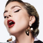
Controversiaga 14,462 Posted April 13 Share Posted April 13 7 minutes ago, Gorehound said: The album cover that should have been Somehow this feels more Joanne than it does feel ARTPOP Pronounced like “Balenciaga” . Emphasis on the “Ga” Quote Link to post Share on other sites More sharing options...
Gorehound 5,572 Posted April 13 Share Posted April 13 3 minutes ago, Controversiaga said: Somehow this feels more Joanne than it does feel ARTPOP Quote Link to post Share on other sites More sharing options...
Controversiaga 14,462 Posted April 13 Share Posted April 13 (edited) 8 minutes ago, Gorehound said: I think it’s cause the wig looks like hay in a barn, or some kind of bird nest Edited April 13 by Controversiaga Pronounced like “Balenciaga” . Emphasis on the “Ga” 3 Quote Link to post Share on other sites More sharing options...
Gorehound 5,572 Posted April 13 Share Posted April 13 3 minutes ago, Controversiaga said: I think it’s cause the wig looks like hay in a barn, or some kind of bird nest It's one of my favourite looks from her. I don't think she's ever looked so beautiful and exotic. 1 1 Quote Link to post Share on other sites More sharing options...
Controversiaga 14,462 Posted April 13 Share Posted April 13 Just now, Gorehound said: It's one of my favourite looks from her. I don't think she's ever looked so beautiful and exotic. It really is an amazing photo tho. She looks amazing. I agree. it feels so natural and stripped down and simple - which ARTPOP is none of that imo Pronounced like “Balenciaga” . Emphasis on the “Ga” 1 Quote Link to post Share on other sites More sharing options...
lompavibl 126 Posted April 13 Share Posted April 13 1 hour ago, Vimo said: I absolutely love the photoshoot. I just never understood why she chose that one for the cover. Tbh I don‘t think it was her decision. I think Interscope chose it. Even tho I love the original cover I think this one would‘ve been even better: 4 Quote Link to post Share on other sites More sharing options...
Controversiaga 14,462 Posted April 13 Share Posted April 13 Just now, lompavibl said: Tbh I don‘t think it was her decision. I think Interscope chose it. Even tho I love the original cover I think this one would‘ve been even better: This picture is so gross and off putting to me for some reason. I could see why they’d not want this to be the official cover Pronounced like “Balenciaga” . Emphasis on the “Ga” 1 Quote Link to post Share on other sites More sharing options...
Gorehound 5,572 Posted April 13 Share Posted April 13 9 minutes ago, Controversiaga said: It really is an amazing photo tho. She looks amazing. I agree. it feels so natural and stripped down and simple - which ARTPOP is none of that imo Ye true. But if you look at all the work she did with Inez and Vinoodh for ARTPOP it's all very minimalistic, clean and fresh - elegant almost - like the interior of a modern art gallery, and I think that was initially what she wanted for the album, until Jeff Koons got onboard with his postmodern pop art. There's also elements of Inez and Vinoodh's style in the G.U.Y video so its all kind of a mishmash. 1 Quote Link to post Share on other sites More sharing options...
Gorehound 5,572 Posted April 13 Share Posted April 13 (edited) 14 minutes ago, Controversiaga said: This picture is so gross and off putting to me for some reason. I could see why they’d not want this to be the official cover It screams goth metal I LOVE it. Very inspired by the likes of Marilyn Manson, Alice Cooper and Nine Inch Nails etc. I think it's a much bolder and edgier choice for an album cover than the one we got, and suits the album better to. Also, it's no more gross and off putting than the greasy alien horns and slime from BTW. Edited April 13 by Gorehound 1 Quote Link to post Share on other sites More sharing options...


Featured Posts
Join the conversation
You can post now and register later. If you have an account, sign in now to post with your account.