palma 8,905 Posted April 13 Share Posted April 13 Objectively I think TFM Blonde cover. But BTW special edition encapsulates her best as an artist. BTW Collection is my personal all time fave cover. Is there some reason my LG7 isn't here? Has she died or something? Quote Link to post Share on other sites More sharing options...
Zombiecat 17,843 Posted April 13 Share Posted April 13 Chromatica = TFM > BTW > the rest Quote Link to post Share on other sites More sharing options...
Lemon Blood 580 Posted April 13 Share Posted April 13 I picked MAYHEM because it’s my favourite at the moment, but my top 3 are Chromatica, Born This Way (yes the standard edition cover) and MAYHEM I’m always craving Dragon Fruit Quote Link to post Share on other sites More sharing options...
Ultimecia 6,644 Posted April 13 Share Posted April 13 Chromatica is at the top. It is intricate, intentional and loaded with symbolism, while perfectly capturing the sound of the album. MAYHEM is the exact opposite of that, it is by far the worst. Time. It will not wait, no matter how hard you hold on... 1 Quote Link to post Share on other sites More sharing options...
Kayioshka 3,115 Posted April 13 Share Posted April 13 2 hours ago, OMonster said: The Fame Monster I like it, I can figure her as a fancy funky monster with these shapes. But I can also figure her as a vampire and hidding her teeths ("Show me your teeths"). Very gothic, it fits to the whole aesthetic and themes of The Fame Monster. 2 hours ago, OMonster said: Mayhem Very subtle ref to the concept of a broken mirror/glass reflecting her conflictual interiority. You see two Gaga there. There is a knife it's a ref to Don't Call Tonight when she says "we twist the knife so many times to say goodbye". The knife is adding violent tensions between them : one could use it to kill the other. 2 hours ago, OMonster said: ARTPOP This one is more colorful and very pop-art. You see Gaga a pop icon looking like a classical statue. She seems to give birth to the blue shining ball that was crafted by Koons. And behind her there are two masterpieces of the Italian Renaissance representing Greek myths. Renaissance is basically an era of return to the classics of Antiquity era. It's about an infinite cycle. The font and the image assembly is modern. 2 hours ago, OMonster said: Born This Way She represents a transhumanistic hybrid between a woman and a vehicle. It's a rebellion against the idea that we should accept what nature gives us and weaken us. It's about empowering to embrace our true individual nature. "Born this way" is some sort an ironic and true title. She vehicles the philanthropic ideas of her album. The other are good and fit to their themes, but less striking. In my peace era. 1 Quote Link to post Share on other sites More sharing options...
Controversiaga 14,472 Posted April 13 Share Posted April 13 33 minutes ago, Gorehound said: It screams goth metal I LOVE it. Very inspired by the likes of Marilyn Manson, Alice Cooper and Nine Inch Nails etc. I think it's a much bolder and edgier choice for an album cover than the one we got, and suits the album better to. Also, it's no more gross and off putting than the greasy alien horns and slime from BTW. Yes the slime in btw era was not my cup of tea really tooooo Pronounced like “Balenciaga” . Emphasis on the “Ga” 1 Quote Link to post Share on other sites More sharing options...
dynamite 65,939 Posted April 13 Share Posted April 13 (edited) Chromatica followed (or preceded by) Btw face closeup Tbf the motorbike has grown on me too so that Edited April 13 by dynamite Like a poem said by a neydy in red Quote Link to post Share on other sites More sharing options...
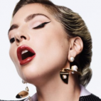
PornoDanceFight 1,981 Posted April 13 Share Posted April 13 Born This Way (standard; the motorcycle is so iconic and very Diamond Dogs) The Fame Monster (Deluxe Edition (blonde)) Mayhem (standard) = Mayhem (CSTH vinyl cover) The Holy Trinity Quote Link to post Share on other sites More sharing options...
gagzus 20,988 Posted April 13 Share Posted April 13 (edited) BTW’s being a reference to 1980s metal albums will forever be her best album cover. That whole album shoot is goated and still hasn’t been topped Edited April 13 by gagzus 3 Quote Link to post Share on other sites More sharing options...
RochesterJoannster 4,007 Posted April 13 Share Posted April 13 (edited) Joanne is absolutely beautiful! I can see why others wouldn’t pick it as their favorite though. ARTPOP is my other favorite with it’s ADHD Mayhem’s was a disappointment to me. Such perfection deserved perfection, although far be it for me to critique her vision. It’s the only one that doesn’t “match” the album to me. Edited April 13 by RochesterJoannster 1 Quote Link to post Share on other sites More sharing options...
MAC 1,962 Posted April 13 Share Posted April 13 I love the standard BTW cover Quote Link to post Share on other sites More sharing options...
DESTROY UR DISEASE 19,004 Posted April 13 Share Posted April 13 Chromatica might not be her strongest body of work but she absolutely KILLED IT with that cover art right behind it I think I'd put ARTPOP I can smell your sickness I can... Quote Link to post Share on other sites More sharing options...
bxr 1,848 Posted April 13 Share Posted April 13 7 hours ago, Gorehound said: I love this alternative cover so much. I wish it was the standard. So metal Low-key uncanny callback Spoiler 3 Quote Link to post Share on other sites More sharing options...
elegidadedios 4,636 Posted April 13 Share Posted April 13 8 hours ago, NUTELLA said: There's a special place in hell for people who hate the standard MAYHEM cover, just FYI It's her best cover hands down. The timeless feeling of it all takes the winning place for me 1 Quote Link to post Share on other sites More sharing options...
elegidadedios 4,636 Posted April 13 Share Posted April 13 5 hours ago, RochesterJoannster said: Joanne is absolutely beautiful! I can see why others wouldn’t pick it as their favorite though. ARTPOP is my other favorite with it’s ADHD Mayhem’s was a disappointment to me. Such perfection deserved perfection, although far be it for me to critique her vision. It’s the only one that doesn’t “match” the album to me. I like the Joanne one, I truly think it would be immaculate - if it wasn't for the fact that the font is awful, imo. It'd be much better without the text on it or, at least, another font. The "/" choice ain't good either. That aside, I love the picture. She truly doesn't have a bad cover Quote Link to post Share on other sites More sharing options...


Featured Posts
Join the conversation
You can post now and register later. If you have an account, sign in now to post with your account.