BuzzcutSeason 3,307 Posted May 6, 2014 Share Posted May 6, 2014 Marry The Night is a strong song that needs strong art. With this round there was less popularity, but yet a good outcome. This round is a Face Off. With 3 artists, this can go any way! Here we go: 1. By: MORECOWBELL 2. By: PopReaper 3. By: HIMER0S Now here you can vote! Only 1 could win so enjoy this round!! Voting is now closed. And make sure to COMMENT which one you loved, and why..artists love contructive criticism, and compliments!!!! And start preparing your tools cuz the next song is PARTYNAUSEOUS Link to post Share on other sites More sharing options...
TimisaMonster 31,073 Posted May 6, 2014 Share Posted May 6, 2014 HIMEROS Stream my new single, 💜"Heartbeat"💜, on Spotify! Link to post Share on other sites More sharing options...
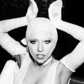
White Shadows 0 Posted May 6, 2014 Share Posted May 6, 2014 I hate to be one of those people but I'm not a fan of any of them. The first one is textured well but the font looks very unprofessional. The second one, again is textured beautifully but is detracted by the font/placement. The third one's transparent doesn't quite blend with the background and it comes off as tacky. Link to post Share on other sites More sharing options...
BuzzcutSeason 3,307 Posted May 6, 2014 Author Share Posted May 6, 2014 So i cannot choose favorites, therefore i can't vote. BUT YOU CAN. But next round is PARTYNAUSEOUS So i'd prepare your canvas. Link to post Share on other sites More sharing options...
BuzzcutSeason 3,307 Posted May 6, 2014 Author Share Posted May 6, 2014 even tough comments have been low, believe me we have a good amount of votes Link to post Share on other sites More sharing options...
warhol killah 8,764 Posted May 7, 2014 Share Posted May 7, 2014 when's the next round? a GAGA sound fanatic ✴ graphic design Link to post Share on other sites More sharing options...
HIMER0S 662 Posted May 7, 2014 Share Posted May 7, 2014 HIMEROS :) Thanks! :) I hate to be one of those people but I'm not a fan of any of them. The first one is textured well but the font looks very unprofessional. The second one, again is textured beautifully but is detracted by the font/placement. The third one's transparent doesn't quite blend with the background and it comes off as tacky. It's meant to blend like that, she is blended half with moon... some ''bond'' with night... ;) I don't need eyes to see Link to post Share on other sites More sharing options...
BuzzcutSeason 3,307 Posted May 7, 2014 Author Share Posted May 7, 2014 when's the next round? soon! its PARTYNAUSEOUS!!! Link to post Share on other sites More sharing options...
BuzzcutSeason 3,307 Posted May 9, 2014 Author Share Posted May 9, 2014 K last time to vote!!!! Tonight will be PARTYNAUSEOUS ENTRYs Link to post Share on other sites More sharing options...


Featured Posts
Archived
This topic is now archived and is closed to further replies.